As 2024 draws to a close, it’s the perfect time to reflect on the year’s evolution in the landscape of visual website design. The rapid growth of technology has ignited a wave of new design concepts, which are emerging as trends. Templated design tools and AI-assisted design have become more prominent, shaping the influx of widespread trends. In this blog post, we’ll explore the standout web design trends of 2024.
The design elements are categorized into the following groups:
- Navigation
- Animation and Motion
- Typography
- Graphic design
Navigation
The classic banner header and sidebar navigation have long been staples of web design, offering familiarity and ease of use. However, with careful user experience planning, navigation has evolved beyond these conventions. Here are some navigation styles we have seen this year.
Full Screen Navigation
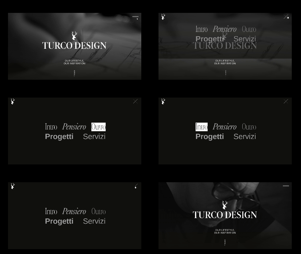
Full-screen navigation menus, often represented by three horizontal lines on mobile (the "hamburger" icon), have made their way into desktop navigation. See example websites Turco Design and Pesquera Diez, where they opt for the usage of large, bold, full screen text, in replacement of a sticky header. This can be used to provide a more dramatic effect; also enabling consistency between the mobile and desktop experience. A more extreme version of this is seen in BRICK, where navigation links are displayed in moving blocks.
Gamified Navigation
Gamification involves incorporating game-like elements into your website to engage users and create a memorable and fun experience. It can be applied to task completion, user loyalty rewards, content displays, social interaction, and more. It often takes the form of a video game-like journey, guiding users through different pages or content. The website OTSea provides an example of game-like navigation experience.
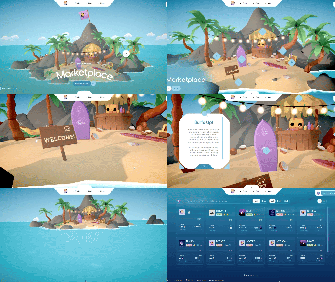
Creative navigation can be engaging and memorable, but extreme examples may deviate from the principles of clear and intuitive design. While unique navigation experiences can add a distinctive touch, they risk causing user frustration or confusion. This highlights the importance of thoughtful user experience planning to strike the right balance.
Animation and Movement
With high-quality screens, high-speed internet, and fast processing capabilities, the use of animation and video on websites has surged. Today, websites without some form of motion can feel outdated. Influenced by TikTok-style reels and similar media, we’ve grown accustomed to constant movement, often with multiple elements in motion at once. What was once considered distracting or overly busy is now widely accepted as the norm.
Parallax and Complex Scroll Animations
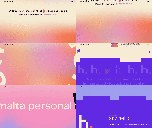
Parallax motion is an animation technique where different elements on a page move at varying speeds, typically triggered by scrolling. This variation in motion creates an illusion of depth, distinguishing the foreground from the background and drawing attention to specific objects. Beyond its functional appeal, parallax motion can add a creative, playful, and visually engaging touch to a website. When used thoughtfully, it enhances the aesthetic, delivering a sleek and modern feel.
In extension of Parallax scrolling, intricate and complex scroll-triggered transition animations have become common modern web design, adding depth and interactivity to user experiences. These animations guide users through content, creating a more immersive journey.
Cinemagraphs
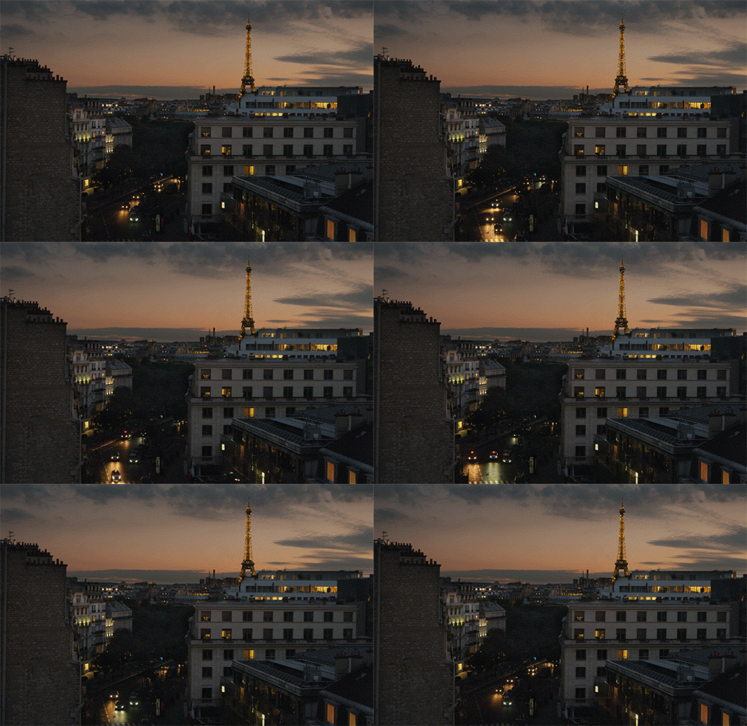
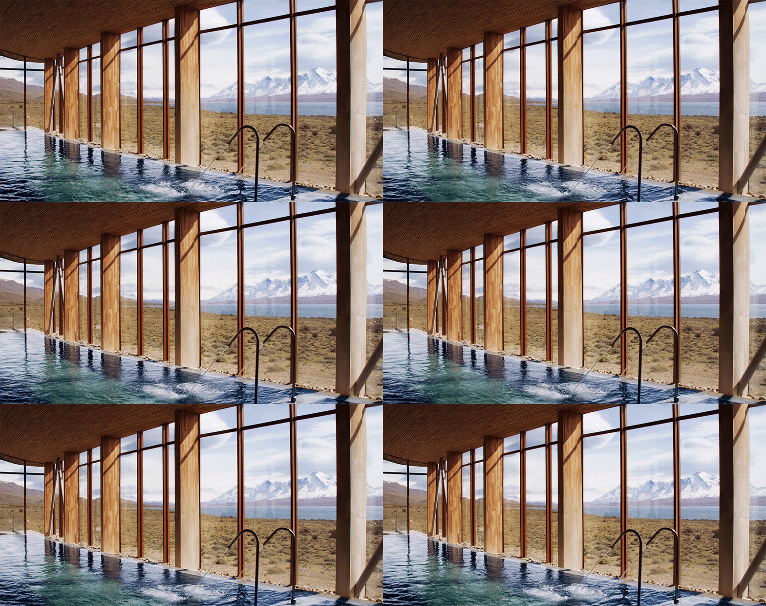
Cinemagraphs are high-quality, short looped videos, usually about 3-5 seconds long. They are like a moving picture; not quite long enough to be considered a video. Subtle zoom effects, or dynamic movement can enhance otherwise static images. Isolated movement like stars twinkling, or isolated moving elements cultivate a magical like quality within the photos. The examples below come from the website cinemagraphs.com. Whatever the technique, they are a way to immerse the viewer into the experience, pushing them one step closer into the virtual world. They are a fantastic way to make your content more captivating, artistic, and alive.
Text Animations
Subtle text movement has been incorporated into web design for many years. More recently however, designers have embraced bolder, more eye-catching techniques. Infinite loops of moving text create a sense of perpetual motion, similar to cinemagraphs. Typing animations, which reveal headers or short statements letter by letter, can act as a way to capture attention and encourage the viewer to focus on the message. Similarly, statements with a single changing word to tell a story and build a brand identity, keeping the final word static to emphasize its importance and convey.
Typography
Typography is highly susceptible to trends; everything from font families and styles to letter placement and sizing. These shifts often reflect broader design movements and cultural preferences, making typography an ever-evolving aspect of design.
Decorative fonts
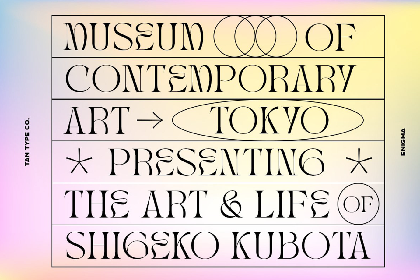
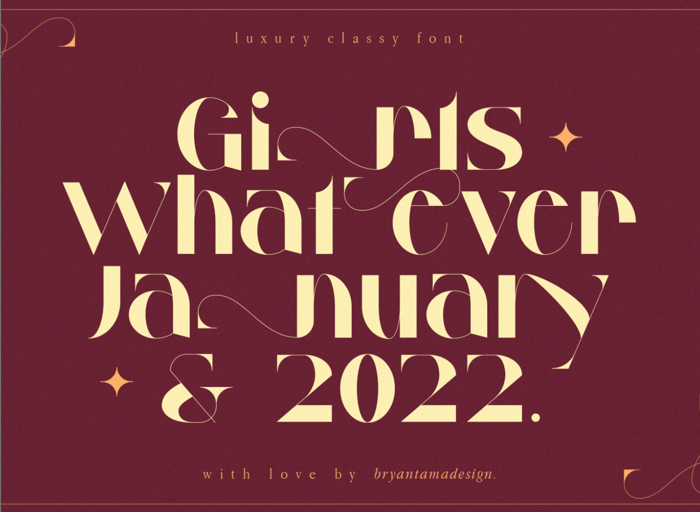
These are highly stylized font, designed to make a visual impact. They often feature intricate details, playful curves, and unique shapes, and are mostly used in headlines, logos, and branding. Some examples are TAN NIMBUS, Millgary, Milky, Chee, Modwood, Rocline Modernand Zighead.
Structured Typography
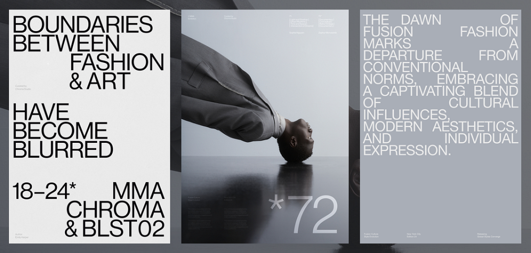
Structured typography refers to sans-serif fonts with bold, strong, solid shapes, in all caps, often seen on homepages. It can be used in full width view to frame a section, or playing around with word placement, as seen in the example below.
Neo-Retro
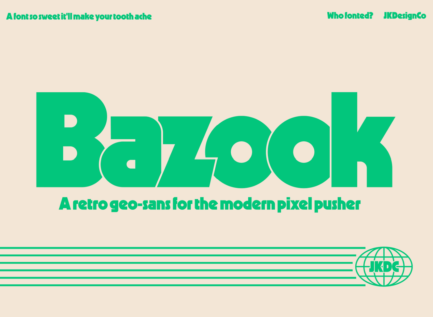
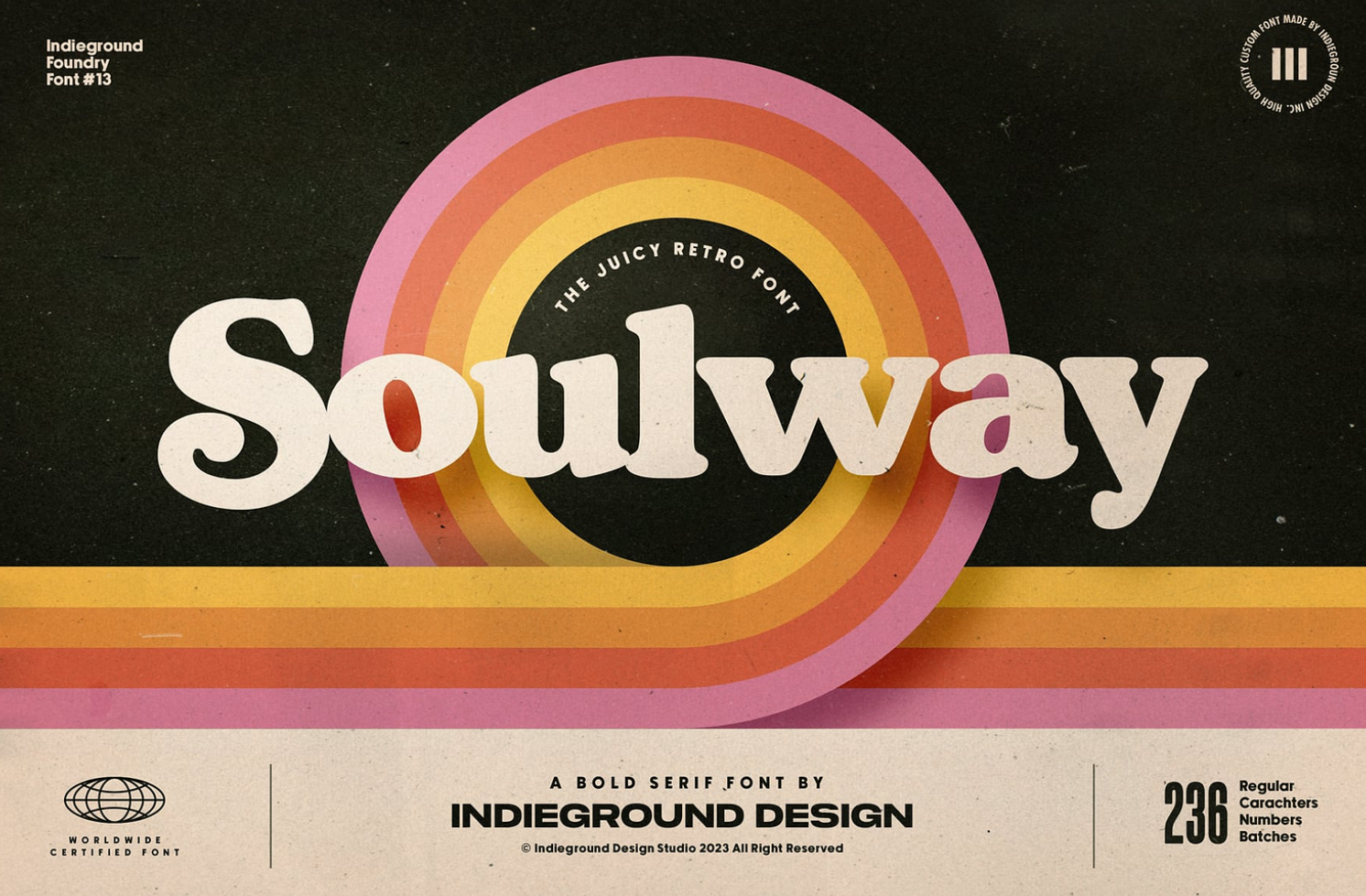
The Neo-Retro typography trend blends vintage styles with modern feel, mixing in seamlessly with contemporary websites. Some examples of popular fonts are Gelica, Nellie, and Bazook.
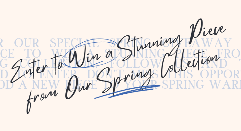
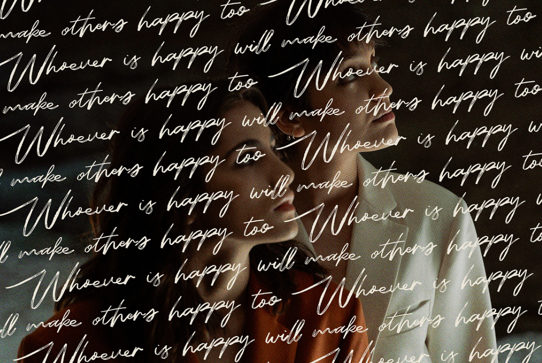
Scribble Script Font
These are playful, handwritten-style fonts that mimic the natural flow of casual writing. The characters appear uneven and imperfect, as if they were quickly written, and therefore convey a personal and informal touch. Some examples are Mistrully, and In Love With Rome Script. The circled and underlined words in the example below have also been common themes in design this year.
Monospaced
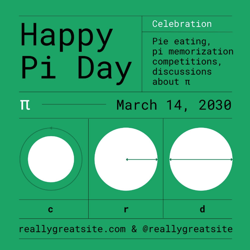
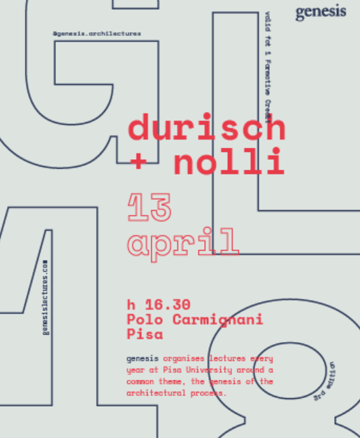
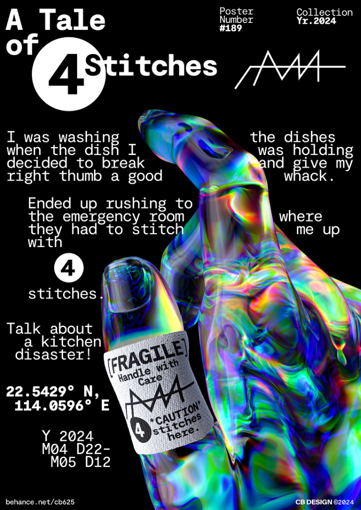
Monospaced fonts are defined by having a fixed width for each character. This helps with alignment, and is used in programming text editors to maintain horizontal alignment. Some examples are Courier, Roboto Mono, and Source Code Pro. These fonts are showing up all over the web, both in technology focused contexts (see Reown) and others, used for both titles and text.
.png?sfvrsn=74cd4e61_1)
Vertical and Circular Text
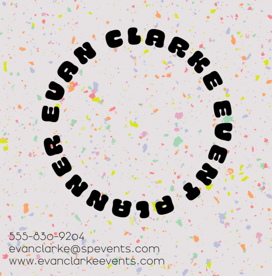
Text shapes can be used to add a dynamic twist to the design, drawing attention by breaking the typical left-to-right flow. Vertical text, either rotated or stacked, can create a sleek and modern feel. Circular text introduces a playful and creative feel, often enhancing interest around logos or badges.
Graphic Design
With the rise of Canva and other templated design tools, trends in graphic design have become highly visible and widely adopted. Currently, we’re seeing a strong emphasis on repeated design elements, including grid lines, grid dots, random shapes, heavy corner radii, separation lines, organic forms, and textured blurs. A notable trend is the influence of math-inspired aesthetics—grid lines and dots evoke the look of math notebooks, while organic shapes and mathematically inspired shapes and surfaces. These elements bring a sense of structure and creativity, blending precision with artistic expression.
Grid Lines and Grid Dots
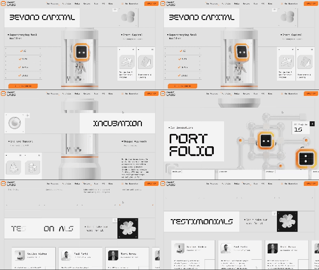
Grid lines and grid dots are incorporated into designs, sometimes used as a background, and sometimes as a distinct element in the design. Grid lines can also be used to provide balance, structure, and clarity of sections - see the Pi Day poster above. ChainGPT Labs website acts as an examples of structured grid lines in layout design.
Texture, Gradients, and Blurs
Blurs and textures are excellent tools for adding depth and dimension to designs that might otherwise feel flat. Noisy gradient blurs, in particular, combine subtle color transitions with grainy textures, creating a dynamic, modern aesthetic. This trend adds a sense of movement and visual interest, making designs feel more tactile.
Shapes
Another design trend gaining traction this year is the use of random, abstract shapes integrated into designs. Torus like shapes, in particular, with their smooth, looping structure, evoke a sense of fluidity and modernity. They are often combined with gradients, metallic textures, or vibrant colors. These shapes often suggest a feeling of a futuristic reality. These abstract shapes can break up rigid designs, introduce contrast, and guide the viewer's eye, making them a versatile trend in graphic design.
Examples
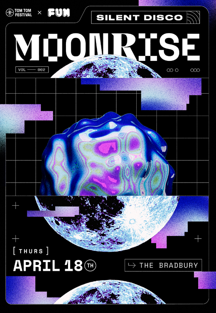
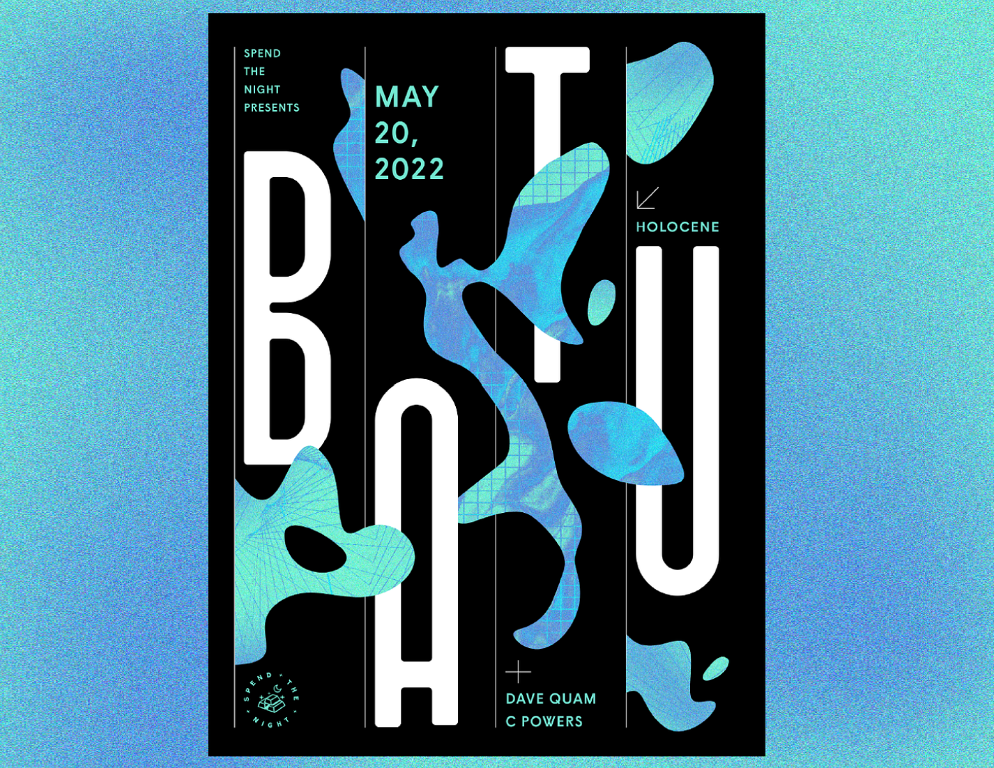

The posters above use many of the trendy design elements mentioned. They use monospaced, and decorative fonts, with circular and irregular letter placement. Grid lines or dots are used as backgrounds, elements, or for structural organization. They include noisy gradient, fluid shapes, and randomly dispersed shapes or surfaces.
The website wodniak.dev provides an example of many trends being used. The title uses structured typography to create a bold eye catching title, taking the full width of the screen. Throughout the page, grid lines are used in different ways: structurally to organize content, as backgrounds, and to create an illusion of depth. The wavy lines give an organic shape, and are responsive to mouse over, which engages the audience to interact with the site. After scrolling down, the space is transformed with a dotted grid in the background, and parallax motion showing a slideshow of projects.
Conclusion
The web design trends of 2024 showcase a blend of creativity, technology, and lively design. From bold animations and intricate transitions to playful shapes and unique typography, these trends reflect a growing emphasis on immersive, memorable experiences. As web design continues to evolve, the key lies in balancing aesthetics with functionality to create designs that are both visually captivating and user-friendly.