For many reasons, a lot of websites and applications follow user interface (UI) patterns that have developed through society’s increasing familiarity with digital products and repetition of these patterns in a wide array of contexts. Some users intuitively know that a hyperlink to “contact” or “terms of use” pages are often found in the footer of a site. Other users instinctively know that three horizontal lines (also known as a hamburger icon) stacked on one another often indicate “click me to access a menu”. This innate awareness of UI patterns, of course, varies by user but is nonetheless often harnessed by UI designers in an effort to make navigation easy and intuitive.
But what about if you’re ready to burst out of your shackles? What if you want to break the mold and want to implement a navigation solution that eschews traditional patterns? How do you make navigation not only unique, but also useful and a joy to use? Unconventional navigation can set a website apart and distinguish it from the pack. Moreover, as you'll see, intelligently integrating your navigation with your content can help leave a longer lasting, more impactful impression on your visitors.
We’ll take a look at instances of sites with menus that do something a little different. With all these sites, I highly recommend actually visiting them - actual interaction is worth 1000 words!

First up, a relatively small site that leverages its site architecture into a clever navigation menu. Club of the Waves is a site devoted to showing off art and photography that focuses on surfing and surf-culture. The menu on root level of the site integrates copy and navigation into a site intro from which you can select either the “art” or “photography” section of the site. Clicking on either of these selections brings you to a list of artists or photographers/filmmakers from which you can select an artist.
I love how they’ve leveraged the site’s relatively simple site architecture into a creative navigation menu that serves as both a site introduction and a navigation solution. They also use this technique at the end of specific artist pages, integrating a call-to-action and navigation in a single stroke by encouraging users to “See more artists and photographers”. I just wish that the navigation from artist pages was more user-friendly. Links to “Home” and a link to “More Creatives” appear only when you’re scrolling up the page. Moreover, I also wish there was quick way to flip between the “artist” and “photographer” sections of the site (users have to navigate “Home” and then navigate to either section, or enter the URL manually).

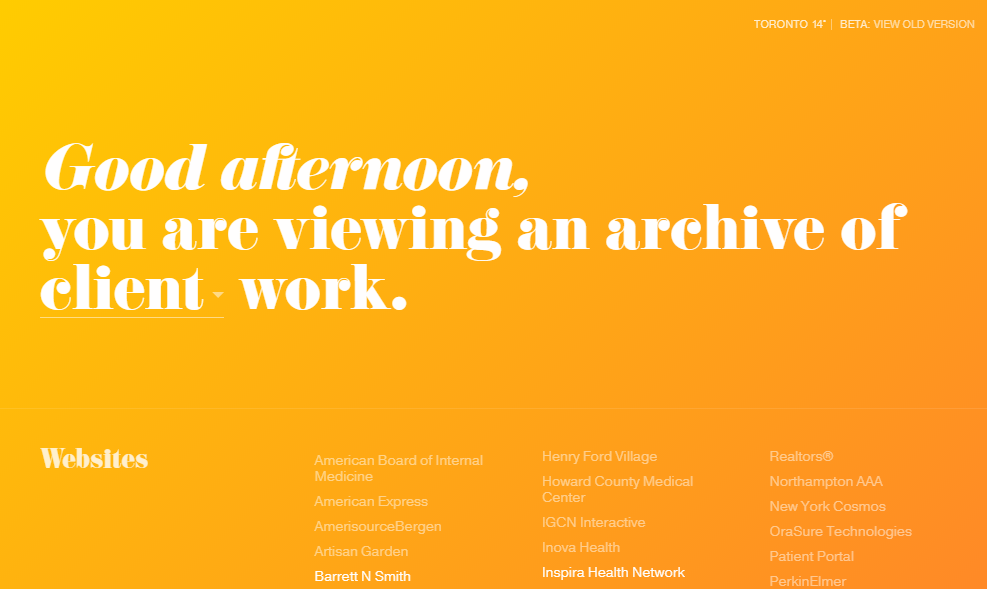
Much like Club of the Waves, the portfolio site for UX designer Jon Montenegro integrates navigation and copy into a harmonious solution. While the primary navigation menu isn’t navigation in the most traditional sense (as you don’t step between different URLs) it is elegant, simple, and integrates beautifully with the content of the site. The dropdown menu allows users to filter which category of work they would like to see from a long list of works. Selecting a filter hides works that do not fit the filter.
Works that fit the filter with case study sub-pages are presented to the user as solid white text, while works that fit the filter but do not have a case study sub-page are more transparent. Works are further divided into rows classified by “websites”, “applications”, “ads/branding/print” and “interactive art”. After selecting a project, users are presented with a back button to step back to the root page of the site to select a new project from this list.
The navigation solution implemented by Montenegro is simple, intuitive, and cleverly integrated with context. It works neatly with both the end user’s needs to view work as it pertains to specific categories, as well as the developer's need to show off his work on specific projects. Moreover, the site helps Montenegro show off a broad list of clients despite a limited number of case studies

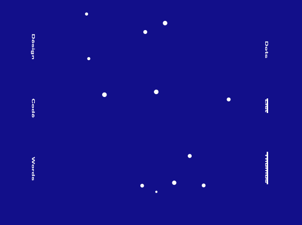
The portfolio site for designer and developer Alaa Alnuami gives users a variety of interface options for exploring his work. The “Dots” option represents his work as a series of dots lazily floating around the page, “List” simply shows his work in a list (broken up into categories) , and “Thumbs” shows thumbnails. The icon in the bottom right reveals a colour randomizer that changes the colour palette of the site.
There’s a lot of joy to be found in navigating through Alunami’s site, in part due to his skill with animations and transitions. Using the “Dots” interface is especially delightful. Hovering over a dot causes it to expand outward into a polygon, revealing a preview of the work. “Dots” gives us a navigation menu on the left as well, enabling users to narrow down works into the categories of “Design”, “Code” and “Words”.
Notably, all the menu options from the home page are rotated 90 degrees from the horizontal plane. While this is not particularly accessible or easily readable, it helps give the site a unique identity. This, as well as the pixelated font, minimalist interface, and organic yet technology-inspired animations help to give the site its avant-garde, pseudo-cyberpunk character.

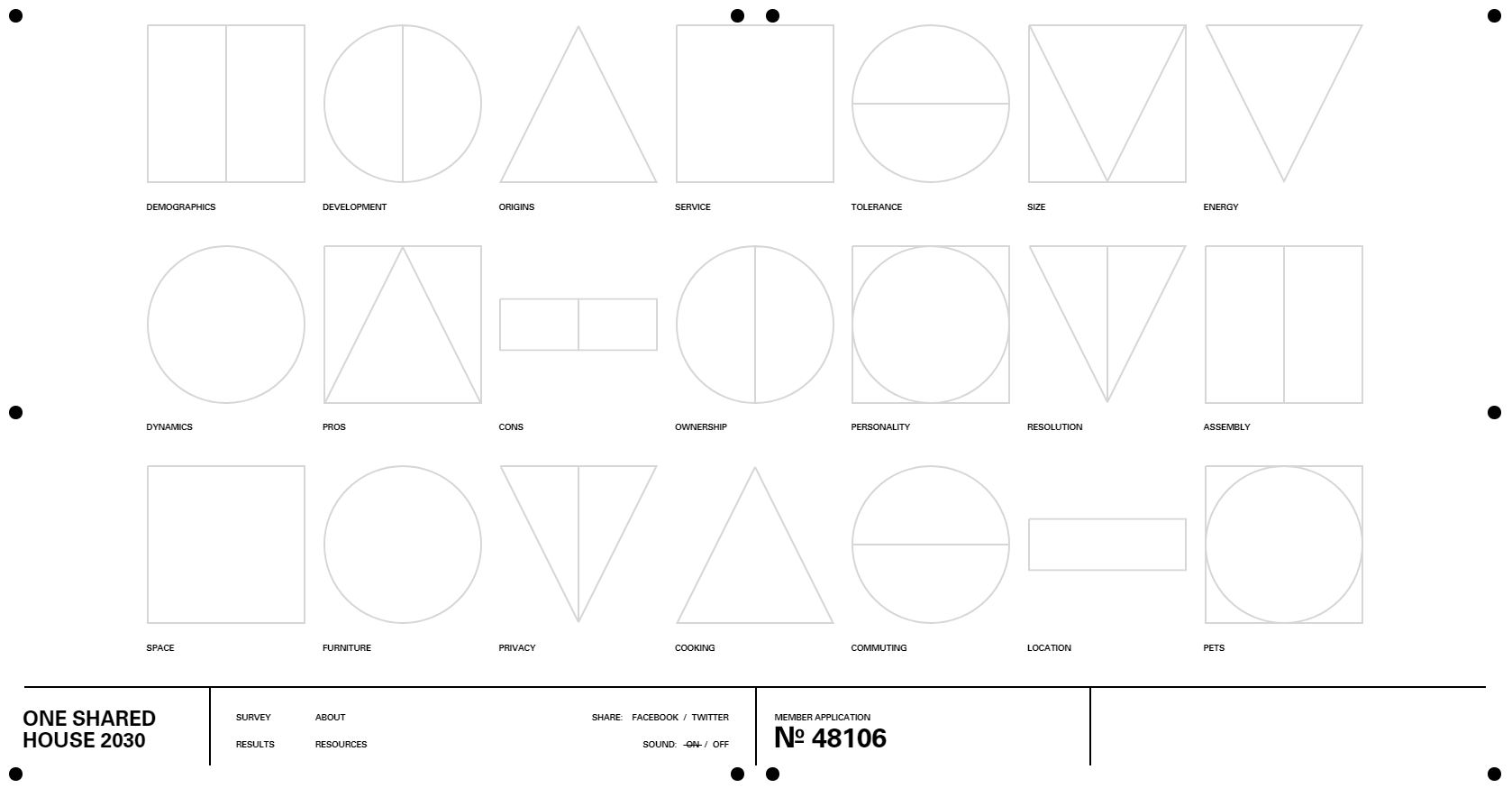
Urban planning, architecture, and housing solutions have always been topics that I could geek out over for hours. You can likely imagine my joy when I came across onesharedhouse2030.com, a site that integrates these interests with great user experience (I love that super-slick onboarding video used to introduce the site) and an unconventional user interface. The site is (primarily) a survey that aims to collect the opinions of users on communal living.
The navigation menu is divided into four sections by black borders, lending it a structured appearance and hinting towards the stylistic inspiration of pen and paper forms. The first two sections always show the site logo (in the first) and links to sub-pages and social media accounts in the second. The third and fourth sections are reserved for contextual information - your applicant number when you begin the survey and various calls-to-action (depending on the page that you’re currently on). Question topics are indicated by abstract icons with small labels. These icons fill with colour following the completion of its question. Similar to Jon Montenegro’s site, users on the “Results” page can filter survey results through dropdown selections.
An easier way of navigating back to the list of questions would be useful (you can only navigate back to the questions after navigating away from the page by restarting the intro and skipping it). I’d also appreciate a clearer way of navigating back to your previous page (for instance, you would have to click the link to “About” if you navigate to another page and then wish to return to "About"). Stylistically however, the navigation fits in perfectly with the site. Setting the navigation menu to the bottom has multiple effects. It not only places heavier emphasis on the main content of the site, it also lends the site unique character by virtue of the fact that most sites do not use navigation oriented at the bottom of the screen. The styling is clean and contextually appropriate (I adore the use of strikethroughs to indicate what page you’re currently on). The fact that answered questions have coloured icons easily indicate to users what answers they have filled out. Moreover, the animated sequences of the icons filling in with colour give users rewarding visual stimuli for completing questions (much like a raven or crow, shiny objects entertain me endlessly).
Up next on "Ordering Off Menu", we'll continue our journey around the web and wrap up with three other sites that knock their creative navigation solutions out of the park.
Author: Mia Ellis-Lee
Web Developer